

An outreach progress dashboard should fit on one page, organized into three tiers: activity, engagement, and conversion. If it needs a second tab or a scroll bar, it's already too complicated for a campaign staffer to check between door shifts.
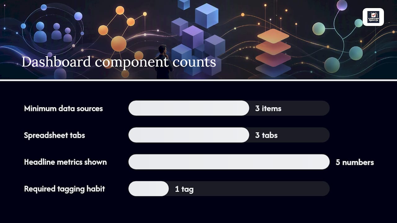
Five numbers need to sit on that page at all times. Meetings booked tells you if outreach is producing anything real. Positive reply rate tells you if your message is landing. Outreach-to-meeting rate tells you the true conversion math from touch to sit-down. Deliverability rate tells you if your emails or texts are even arriving. Connection acceptance rate tells you if your digital outreach is opening doors at all.
- Meetings booked (rolling 30 days) — the outcome that matters most
- Positive reply rate (current sequences) — separates real interest from noise
- Outreach-to-meeting rate (rolling 90 days) — the honest conversion number
- Deliverability rate (sending domains) — catches technical failures before they tank a week
- Connection acceptance rate (LinkedIn or equivalent) — flags a stale message or bad targeting early
Campaign Buddy HQ builds this kind of dashboard directly into its platform, with a free 7-day trial and no credit card required.
Key Takeaways
A working outreach progress dashboard is a one-page, three-tier view built around five always-visible headline metrics, reviewed weekly for leading signals and monthly for outcomes.
| Point | Details |
|---|---|
| Use three tiers | Separate activity, engagement, and conversion so failures get diagnosed at the right stage. |
| Track five headline metrics | Meetings booked, positive reply rate, outreach-to-meeting rate, deliverability, and connection acceptance. |
| Add a benchmark column | Compare every number against your own trend or a stated target, not in isolation. |
| Tag data at entry | Require sequence tags and first-touch dates so outcomes trace back to their source. |
| Campaign Buddy HQ fits this pattern | Built-in activity logging and progress visualization with a free 7-day trial for campaign-specific workflows. |
Table of Contents
- The Three-Tier Outreach KPI Framework: Activity, Engagement, Conversion
- What Five Headline Metrics Should Sit at the Top of Your Dashboard
- How to Build an Outreach Dashboard This Week
- How Often Should You Review Your Outreach Dashboard?
- How Campaign Buddy HQ Implements This Dashboard Pattern
- Customizing Your Dashboard by Filter, Segment, and Timeframe
- Visualizing Outreach Data Without Overwhelming Your Team
- Setting Targets and Alerts That Actually Get Used
- Fixing Inaccurate or Incomplete Outreach Data
- Tools and Software Suited for Outreach Tracking
- What Most Campaigns Get Wrong About Tracking Outreach
- Getting Your Outreach Dashboard Running This Week
- Sources
The Three-Tier Outreach KPI Framework: Activity, Engagement, Conversion
Most campaigns either drown in metrics or track almost nothing useful. The fix is a three-tier framework that separates what your team is doing from what voters are doing back from what's actually converting. Each tier answers a different question, and failures at one tier point to a different fix than failures at another.
Activity metrics measure output: unique contacts touched, sequences launched, doors knocked, calls dialed. The unique-contacts number matters more than raw sends. A canvasser who knocks 200 doors but hits 180 unique households is doing real work. A phone bank that dials the same 50 numbers four times each is padding a report, not building reach.
Engagement metrics measure response: open rate, reply rate, and positive reply rate. Positive reply rate is the one that actually diagnoses your message, because it strips out auto-replies, "wrong number" texts, and hostile responses that inflate a raw reply rate without meaning anything.
Conversion metrics measure outcomes: meetings booked, show rate, volunteer sign-ups, or pipeline created when you're tracking major donors through a CRM. This tier only works if you tag outcomes back to the sequence or canvass shift that produced them.
- Log activity daily, even if it's a paper tally sheet transferred at night.
- Classify replies into positive, neutral, and negative before you calculate a rate.
- Tag every booked meeting or commitment with its source sequence.
Pro Tip: Don't calculate positive reply rate off total contacts touched. Calculate it off contacts who actually replied, then split those replies into buckets. That's the number that tells you whether your script needs work.
What Five Headline Metrics Should Sit at the Top of Your Dashboard
If you strip an outreach dashboard down to the numbers that must always be visible, five metrics carry the weight: meetings booked (rolling 30-day window), positive reply rate across current sequences, outreach-to-meeting rate over a rolling 90 days, deliverability rate on your sending domains, and connection acceptance rate if you're running any digital or LinkedIn-style outreach.
- Meetings booked shows momentum in the window that matters, not a lifetime total that hides a bad month.
- Positive reply rate flags message fatigue before your whole sequence goes stale.
- Outreach-to-meeting rate over 90 days smooths out week-to-week noise from a single good or bad canvass shift.
- Deliverability rate catches a burned domain or a blocked number before your team wastes a week yelling into the void.
- Connection acceptance rate tells you if your digital targeting is even reaching the right people.
None of these numbers mean much without a benchmark column next to them. Benchmark columns turn a bare number into a signal, either against your own historical average or against a stated campaign target.
For visualization, keep it simple: a KPI tile showing the current number, a small sparkline showing the trend, a percent change versus last period, and a one-click drilldown link to the underlying log. Anything fancier turns a working tool into a slideshow nobody opens on a Tuesday night.
How to Build an Outreach Dashboard This Week
You don't need a data team to get a working outreach progress dashboard running before your next canvass weekend. You need three data sources, one tagging habit, and a place to roll everything up.
- Pull your minimum data sources together: outreach logs (doors, calls, texts), calendar or booking exports for meetings, and CRM opportunity records if you're tracking donors or endorsements.
- Tag every opportunity at creation with a sequence tag and a first-touch date. Do this manually if your CRM doesn't automate it. Skipping this step is the single most common reason campaigns can't answer "which outreach actually worked."
- Start with a structured spreadsheet if your team is under 20 people. Three tabs. Activity, Engagement, Outcomes. Each tab rolls up from raw logs, and a summary tab pulls the five headline numbers to the top.
- Compute pipeline per sequence by filtering your CRM opportunities by sequence tag and summing value or count over a rolling 30-day window, which lets you attribute results back to the specific push that generated them.
- Scale up when logging becomes the bottleneck. Add scheduled exports into a BI tool, or move to a platform with built-in tagging so volunteers aren't hand-entering data at 11pm.
A central spreadsheet with those three tabs is genuinely sufficient for smaller teams. Larger operations eventually want a BI layer like Looker or Metabase sitting on top of exported data.
Pro Tip: Build your Outcomes tab before your Activity tab. Working backward from what you need to report to leadership tells you exactly what raw data you actually need to collect.
For a fuller field-level walkthrough, Campaignbuddyhq's outreach tracking guide for political campaigners covers the tagging discipline in more depth.
How Often Should You Review Your Outreach Dashboard?
Weekly and monthly reviews serve different purposes, and mixing them up is how campaigns miss problems until it's too late to fix them.
Weekly, watch leading indicators: positive reply rate, connection acceptance rate, and sends or contacts per canvasser. A 30% drop in any of these against the prior week should trigger an actual investigation, not a shrug. That's usually a script problem, a burned list, or a volunteer who needs re-training.
Monthly, present lagging outcomes to leadership: meetings booked, pipeline generated, and cost-per-meeting if you're tracking paid outreach. Compare against your own trend and against your benchmark column, and this is the cadence that keeps weekly noise from drowning monthly signal.
When something's wrong, work backward. Start at meetings booked. If that number's down, check outreach-to-meeting rate. If that's fine, the problem is upstream at engagement or activity.
Common mistakes that quietly wreck a dashboard's usefulness:
- Tracking 20 metrics instead of five, so nobody actually looks at it
- Reporting only lagging indicators, which means you catch problems a month after they started
- Skipping the benchmark column entirely, leaving every number floating without context
How Campaign Buddy HQ Implements This Dashboard Pattern
Campaignbuddyhq was built around this exact structure: activity logging for doors, calls, and texts; engagement tracking built into daily and weekly planning; and progress visualization tied to campaign phases instead of a generic sales funnel.
- Daily and weekly logging captures activity-tier data without a separate spreadsheet
- Built-in supporter tracking feeds engagement and conversion metrics automatically
- Campaign phases give you the benchmark context a raw number can't provide on its own
Billy and the Campaignbuddyhq editorial team maintain a library of step-by-step guides, including a manager's guide to monitoring campaign progress, that walk through setup for teams with zero data background.
Try the platform free for 7 days, no credit card required, and see whether it replaces your spreadsheet before you commit to anything.
| Point | Details |
|---|---|
| One-page dashboard | Keep activity, engagement, and conversion tiers on a single page. |
| Five headline metrics | Track meetings booked, positive reply rate, outreach-to-meeting rate, deliverability, and connection acceptance. |
| Campaignbuddyhq option | Offers built-in activity logging and progress visualization with a free 7-day trial. |
Customizing Your Dashboard by Filter, Segment, and Timeframe
A dashboard that shows every volunteer's numbers blended together hides more than it reveals. Filters by canvasser, by turf or precinct, and by sequence let a field director spot the one underperforming shift instead of averaging it into invisibility.

Segments matter as much as filters. Splitting by contact type (registered voter versus unaffiliated), by outreach channel (door versus phone versus text), or by geography (urban precinct versus rural route) surfaces patterns a single blended number never shows. A rural low-density route often needs a completely different benchmark than a dense urban turf, and lumping them together makes both look mediocre.
Timeframe toggles round out the picture. A rolling 7-day view catches an immediate problem, like a bad script rollout. A rolling 30-day view smooths out day-to-day volunteer variance. A rolling 90-day view, which several of the headline metrics above rely on, shows whether your overall program is actually improving or just having a good week.
Build these as toggles, not separate reports. Nobody rebuilds five spreadsheets to check one filtered number, so if customization requires manual rework every time, it won't get used past week two. Whatever tool you use, the segment and timeframe controls should sit right on the same page as your five headline metrics, not buried in a separate export.
Visualizing Outreach Data Without Overwhelming Your Team
The best outreach dashboards use the fewest chart types that still tell the truth. A KPI tile with a big number and a sparkline handles most of your five headline metrics. Save bar charts for comparing canvassers or turfs against each other, and line charts for trends over time.
Color coding should mean something consistent across the whole dashboard. Green for above benchmark, red for below, and one neutral color for "no benchmark yet" works better than a rainbow of chart colors chosen for looks. If red shows up in one chart for "good" and another for "bad," you've built a dashboard that requires a legend to read, and nobody reads the legend.
Resist the urge to add a chart for every metric you're capturing. A percent-change indicator next to a raw number does more work than a full historical chart most viewers will glance at for two seconds. Save the detailed charts for the drilldown link, not the summary view.
Whitespace matters more than most people building a first dashboard expect. A page with five tiles and generous spacing reads faster than a page with fifteen tiles crammed edge to edge, even though the crammed version technically contains more information. Political campaign staff checking this between shifts need speed, not density.
Setting Targets and Alerts That Actually Get Used
A target only works if it's specific enough to act on. "Improve outreach" isn't a target. "Hit a 15% positive reply rate on the current text sequence by Friday" is a target a staffer can actually check against.
Set targets at the tier level that makes sense for the problem you're solving. Activity targets (contacts per day, sequences launched per week) work best for volunteer coordinators managing day-to-day output. Conversion targets (meetings booked, pipeline created) belong with campaign managers and candidates who need to know if the whole operation is on pace.
Alerts should trigger on movement, not just absolute thresholds. A 30% week-over-week drop in positive reply rate deserves a flag even if the number is still technically above some fixed floor, because a sudden drop usually means something specific broke: a burned list, a bad script edit, a volunteer who stopped following the script. Static thresholds alone miss that kind of sudden change.
Keep the alert list short. Three or four trigger conditions, tied to the same headline metrics already on the dashboard, work better than a dozen rules nobody remembers the reason for. An alert that fires constantly gets ignored within a week, which defeats the entire point of having one.
Fixing Inaccurate or Incomplete Outreach Data
Bad data usually comes from one of three places: inconsistent logging, missing attribution, or a data source that silently stopped syncing. Each has a different fix.
Inconsistent logging happens when volunteers log activity differently, some counting a knock as a contact even when nobody answered, others only counting actual conversations. Fix this with a one-page logging standard distributed before the first canvass shift, not after you notice the numbers look strange.
Missing attribution is the CRM tagging problem showing up downstream. If a meeting gets booked but nobody tagged which sequence or canvass produced it, your conversion tier becomes guesswork. The fix is procedural: make sequence tagging a required field at the point of data entry, not an optional cleanup step someone does later.
Silent sync failures are the sneakiest problem, because the dashboard keeps showing numbers, they're just frozen or wrong. A deliverability rate that hasn't moved in two weeks while your team keeps sending emails is a red flag for a broken integration, not a sign of stability. Check your data sources' last-updated timestamp as part of your weekly review, not just the metrics themselves.
Tools and Software Suited for Outreach Tracking
A structured Google Sheet, split into Activity, Engagement, and Outcomes tabs, handles smaller campaigns well and costs nothing beyond setup time. It falls short once you have more than a handful of people entering data, because manual entry errors compound fast.
Purpose-built campaign platforms like Campaignbuddyhq fold outreach logging, supporter tracking, and progress visualization into one system built specifically for door, call, and text-based campaign work, which removes the manual roll-up step entirely.
Generic CRM platforms work for donor and pipeline tracking if your campaign already runs on one, though most weren't built with door-knocking or phone-banking workflows in mind and need heavier customization to fit.
Full BI tools like Looker or Metabase suit larger operations pulling data from multiple sources, but they require someone with the technical skill to build and maintain the dashboards, which is often more overhead than a mid-sized campaign has budget for.
For general reading on why structured progress tracking matters regardless of which tool you pick, Optio Station's breakdown of progress tracking offers useful project management framing that applies just as well to campaign operations.
What Most Campaigns Get Wrong About Tracking Outreach
The conventional advice on campaign dashboards leans too hard on volume: knock counts, call counts, texts sent. Those numbers feel productive to report, but they don't tell a campaign manager whether the operation is actually working. A campaign can hit its door-knocking target every single week and still lose, because nobody was watching whether those doors converted into anything.
The three-tier framework fixes this by forcing a campaign to connect activity to outcomes, not just report activity in isolation. Positive reply rate matters more than raw reply volume for the same reason. It's the difference between a metric that flatters you and one that tells you the truth.
What campaigns should prioritize first isn't better software. It's the discipline of tagging outcomes back to their source at the moment they happen. A dashboard is only as good as the data feeding it, and most campaigns lose that battle in the first week because nobody made tagging mandatory. Fix that habit before worrying about which platform renders the prettiest chart.
— Billy
Getting Your Outreach Dashboard Running This Week
Campaignbuddyhq is the alternative to a spreadsheet-and-CRM patchwork for campaigns that need this dashboard working before Friday's canvass shift, not after a data team finishes building it. Instead of stitching together Google Sheets, a booking calendar, and a separate CRM export, activity logging, supporter tracking, and progress visualization all live in one system built specifically around doors, calls, texts, and registrations.
That matters most for rural and low-density campaigns, where volunteer time is scarce and nobody has hours to spend reconciling three data sources into one weekly report. The platform's daily and weekly planning tools feed directly into the same three-tier structure this article walks through, so the dashboard builds itself as your team logs activity instead of requiring a separate reporting step at the end of each week.
Start the free 7-day trial, no credit card required, and see your first activity, engagement, and outcomes tiles populate from your own outreach data before deciding whether to commit.
Sources
- Outreach KPI Dashboard: What to Track, Examples & Tool Fit
- Measuring outreach success beyond replies - Outzeach
- Cold outreach campaign KPIs: The metrics every sales team must track in 2026 - DealsFlow