
A campaign dashboard is a centralized visual tool that tracks essential metrics in real time, giving political campaigns a single command center for monitoring progress and improving outreach effectiveness. The role of campaign dashboards goes far beyond simple reporting. Platforms like Campaignbuddyhq, Tableau, and Power BI transform raw outreach data into decision-ready intelligence, covering everything from doors knocked to donor conversion rates. Dashboards enable rapid data visualization, trend spotting, and context-driven decision-making that spreadsheets simply cannot match. For political organizers managing field teams, phone banks, and digital outreach simultaneously, a well-built dashboard is the difference between reacting to problems and preventing them.
How do campaign dashboards improve decision-making and outreach efficiency?
Campaign dashboards function as command centers that replace gut decisions and scattered spreadsheets with clear, real-time visuals of your campaign's vital signs. Dashboards consolidate scattered data into a unified view, identify performance issues as they emerge, and help teams reallocate spend faster than any manual reporting cycle allows. When a phone bank's contact rate drops on a Tuesday afternoon, a dashboard surfaces that signal immediately. Without one, you might not notice until Friday's debrief.
The operational advantages extend directly to outreach efficiency. Real-time data visualization lets field directors see which precincts are underperforming on doors knocked, which text message scripts are generating responses, and which volunteers need reassignment. These are not abstract benefits. They translate to concrete decisions made hours or days earlier than they would be otherwise.

Cross-channel data unification is where dashboards deliver their most underappreciated value. Unified dashboards create a single source of truth with consistent metric definitions, which stops teams from debating whether the email numbers or the CRM numbers are correct. When everyone reads from the same data, conversations shift from "which number is right?" to "what do we do about it?"
Key outreach metrics worth monitoring in real time include:
- Doors knocked and contact rate per volunteer per shift
- Calls made, pickups, and meaningful conversations logged by phone bank teams
- Text message delivery rate and response rate across voter segments
- Event RSVPs and actual attendance to measure mobilization effectiveness
- Donor conversion rate from outreach touchpoints
Pro Tip: Set threshold alerts on your dashboard for metrics like contact rate and delivery rate. When a metric drops below your baseline, you want an automatic flag, not a surprise at the weekly meeting.
What are best practices for designing effective campaign dashboards?
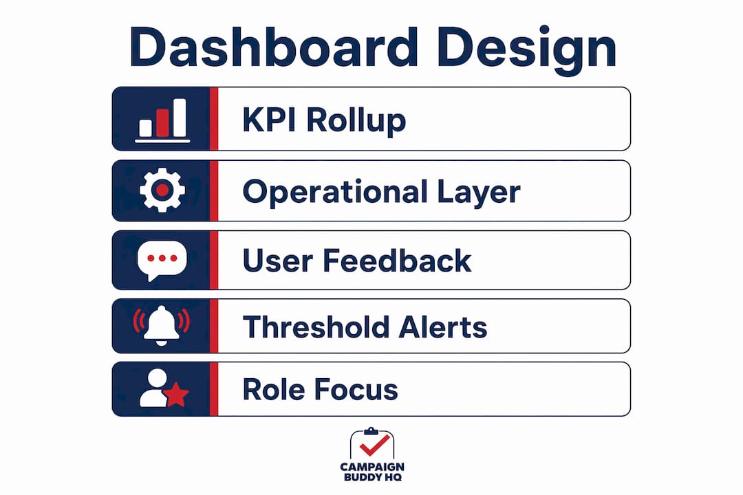
The most common dashboard failure is not a technical problem. It is a design problem. Effective dashboards prioritize clarity by limiting views to actionable KPIs and pairing every metric with context and trend data so numbers become intelligence rather than noise. A dashboard showing 1,200 doors knocked means nothing without knowing whether that is above or below your weekly target and whether the trend is improving.
Follow these design principles to build dashboards that actually drive decisions:
- Limit each view to five to seven KPIs. More than that, and organizers stop reading the dashboard altogether. Prioritize the metrics that directly connect to your current campaign phase.
- Add context to every number. Show the metric alongside its target, its prior-week value, and a simple trend line. A number without context is just a number.
- Use visual hierarchy deliberately. Place the most critical metrics at the top left, where the eye naturally lands first. Use color coding consistently: green for on-track, red for off-track, yellow for watch.
- Build drill-down capability. Leadership needs a summary view. Field managers need to click into precinct-level or volunteer-level detail without switching tools.
- Iterate based on team feedback. Run a two-week review cycle where you ask users which metrics they actually referenced and which they ignored. Remove the ignored ones.
Practitioners recommend building at least two dashboard layers: a leadership KPI rollup for strategic oversight and an operator or field execution view for tactical decisions. This layered approach prevents information overload at the top while giving field staff the granular data they need to act.
Pro Tip: Before finalizing your dashboard design, ask each user role one question: "What decision do you need to make every morning?" Build the dashboard to answer that question first.
Which campaign performance metrics are essential to track?
Tracking the right campaign performance metrics separates campaigns that learn from their data from campaigns that just collect it. Platforms like Oracle Eloqua and HubSpot define core digital metrics precisely, and political campaigns should adopt the same discipline for their outreach data.
The table below separates metrics by category and explains what each one tells you operationally.
| Metric category | Key metrics | What it tells you |
|---|---|---|
| Digital outreach | Delivery rate, open rate, CTR | Whether your messages are reaching and engaging voters |
| Field operations | Doors knocked, contact rate, conversations logged | Whether your canvassing effort is translating into real voter contact |
| Phone and text | Calls made, pickup rate, texts sent, response rate | Efficiency of your volunteer communication channels |
| Fundraising | Donor conversion rate, average gift, repeat donor rate | Health of your financial pipeline and supporter loyalty |
| Demographic | Age, geography, party registration of contacts | Whether you are reaching your target voter universe |
Consistent metric definitions aligned with your source platforms increase dashboard reliability and make comparisons meaningful over time. If your CRM defines "meaningful conversation" differently than your volunteer app does, your contact rate metric is unreliable. Standardize definitions before you build, not after.
The most overlooked metric in political outreach is the contact-to-conversation ratio. A high number of doors knocked with a low conversation rate signals either bad timing, wrong territory, or a script problem. That ratio tells you where to intervene before you burn through your volunteer hours.
How do role-based dashboards enhance team coordination?
Role-based dashboards offer each organizer a data view matched to their specific responsibilities, which reduces cognitive overload and increases the speed of action. A campaign manager does not need to see individual volunteer shift logs. A precinct captain does not need to see the statewide donor pipeline. Giving everyone the same dashboard is the same mistake as giving everyone the same job description.
Here is how role-based views break down in practice:
- Org admins and campaign directors see aggregate KPIs: total voter contacts, fundraising totals, volunteer hours logged, and progress toward phase goals.
- Regional managers and team leads see territory-level performance: which precincts are hitting targets, where volunteer capacity is thin, and which scripts are underperforming.
- Field navigators and canvassers see their personal metrics: doors assigned, doors completed, conversations logged, and their daily target progress.
Geographic heat maps add a layer of spatial intelligence that flat tables cannot provide. When a heat map shows a cluster of low-contact precincts in the northwest corner of your district, a field director can reassign volunteers before the week ends rather than after the election. Real-time logging workflows tied to accountability mechanisms make this kind of mid-cycle adjustment possible.
Time-series trend views are equally powerful for resource allocation. Seeing that volunteer productivity drops every Thursday afternoon tells you something about scheduling. Seeing that text response rates spike on Sunday mornings tells you something about timing. These patterns are invisible in weekly summary reports but obvious in a well-built dashboard.
The accountability benefit is harder to quantify but just as real. When field staff know their logged activity appears on a shared dashboard, outreach activity tracking becomes a shared standard rather than a personal habit. Consistency in logging improves data quality, which improves every decision downstream.
Key takeaways
Campaign dashboards work because they convert fragmented outreach data into role-specific, real-time intelligence that drives faster decisions and measurable accountability across every level of a political campaign.
| Point | Details |
|---|---|
| Centralize your data first | Unified dashboards eliminate metric disputes and let teams focus on decisions, not data validation. |
| Design for decisions, not display | Limit each dashboard view to five to seven KPIs paired with targets and trend context. |
| Build role-based views | Match each user's dashboard to their specific responsibilities to reduce overload and increase action speed. |
| Standardize metric definitions | Consistent definitions across tools make your dashboard reliable and comparable over time. |
| Use real-time logging | Field dashboards only drive efficiency when tied to live data entry and accountability workflows. |
Why most campaign dashboards underperform (and how to fix that)
I have seen campaigns invest real money in dashboard tools and then watch organizers ignore them by week three. The problem is almost never the technology. It is that the dashboard was built to impress leadership rather than to support the people doing the daily work.
The campaigns that get the most out of their dashboards treat them as living tools. They run two-week feedback cycles, remove metrics nobody references, and add context to numbers that keep generating questions. They ask field staff what they actually need to see each morning, not what looks good in a presentation.
The other mistake I see constantly is treating the dashboard as the end product. A dashboard is not a report. It is a decision surface. If your team looks at the dashboard and then has a 45-minute conversation about whether the numbers are accurate, the dashboard has failed. Unified naming conventions and shared metric definitions solve that problem before it starts.
My honest advice: start with three metrics per role, get your team logging data consistently, and add complexity only when the team is asking for it. A simple dashboard that gets used every day beats a sophisticated one that collects dust. The campaigns that build a dashboard-driven culture, where data informs every morning standup and every territory decision, are the ones that catch problems early and adapt faster than their opponents.
— Billy
See how Campaignbuddyhq puts this into practice
Campaignbuddyhq is built specifically for political campaigns and issue advocacy groups that need real-time outreach tracking without the complexity of enterprise analytics tools. The platform gives org admins, team leads, and field canvassers role-specific views covering doors knocked, calls made, texts sent, and progress toward campaign phase goals. Every metric is logged in real time, so territory adjustments and volunteer reallocation happen during the campaign, not after it. If you are ready to move from spreadsheets to a dashboard that actually drives decisions, start your free trial with no credit card required and see the difference in your first week.
FAQ
What is the role of campaign dashboards in political organizing?
Campaign dashboards centralize outreach data into a real-time visual command center, helping organizers track doors knocked, calls made, and voter contacts against campaign goals. They replace manual spreadsheets with decision-ready intelligence that speeds up tactical adjustments.
Why use campaign dashboards instead of spreadsheets?
Spreadsheets require manual updates and create version conflicts across teams, while dashboards pull live data and surface problems the moment they emerge. Dashboards reduce delayed reporting and enable faster responses to underperforming outreach channels.
What metrics should a political campaign dashboard track?
The core metrics are delivery rate, open rate, contact rate, doors knocked, calls made, text response rate, and donor conversion rate. Pairing each metric with its target and a trend line turns raw numbers into actionable campaign intelligence.
How do role-based dashboards improve campaign team performance?
Role-based dashboards give each team member only the data relevant to their responsibilities, which reduces overload and increases the speed of action. Field navigators see personal progress metrics while campaign directors see aggregate KPIs and territory-level performance.
How often should a campaign dashboard be updated?
Real-time or same-day updates are the standard for field operations dashboards, since delayed data makes mid-cycle adjustments impossible. Digital outreach metrics like email open rates and text response rates should refresh automatically as campaigns send and receive data.