

Eight metrics belong on a working field dashboard: pace ratio, contact rate by channel, supporter ID rate, turf completion rate, volunteer shift completion, persuadability targeting lift, conversion/commit rate, and trend direction over time. Of those, pace ratio is the one to check before coffee. It compares actual daily contacts to the pace needed to hit your universe goal, and any reading below 1.0 means something operational has to change today, not next week. Everything else on the dashboard exists to explain why the pace number moved.
TL;DR:
- A pace ratio below 1.0 indicates that the campaign is running behind schedule and requires immediate operational adjustments to meet goals.
- Contact rates should range from 25-35% during GOTV and 20-30% during persuasion phases, with rates under 10% signaling list issues needing correction.
- Real-time dashboard updates, ideally every 15 to 30 minutes, enable quick response to underperforming turfs or shifts, preventing days-long delays.
- The data pipeline must integrate outreach logging with voter files or CRMs, ensuring accurate, current contact and support data for reliable metric calculations.
- Training volunteers and field leaders on how to log data and interpret metrics is essential to foster trust and effective decision-making based on the dashboard.
Table of Contents
- What Field Dashboard Metrics Actually Measure
- How Should a Field Dashboard Be Designed?
- Channel Targets That Tell You Something Is Broken
- Running the Program Off the Dashboard, Not Around It
- How Campaign Buddy HQ Puts This Framework to Work
- Building Reporting Infrastructure That Field Staff Trust
- Setting Realistic Benchmarks Before the Program Starts
- Connecting the Dashboard to Your Voter File and CRM
- Why Update Speed Changes What You Can Decide
- Turning Dashboard Numbers Into Field Decisions
- Keeping the Numbers Clean Enough to Trust
- Getting Volunteers to Actually Use the Numbers
- Dashboards Are Plans, Not Reports
- Get Your Field Program Running on Real Dashboard Data
- Sources
What Field Dashboard Metrics Actually Measure
Pace ratio drives the whole board because it's the only number that tells you, in one glance, whether the math still works. It's calculated as actual contacts per day divided by the contacts per day still required to finish the universe on time. A field director running a Garza-style campaign with an 87,000-voter goal and 35 days left needs a specific daily number, and a pace ratio below 1.0 means the program is running behind what the calendar demands. That's not a footnote. It's the headline.
The rest of the shortlist fills in context:
- Contact rate: the share of attempted contacts that actually connect with a voter, tracked separately for canvass, phone, and text.
- Supporter/ID rate: the percentage of contacts where you recorded a usable support score, not just a knock or a dial.
- Turf completion rate: how much of an assigned walk list or call list got worked, ideally north of 85%.
- Volunteer shift completion: shifts filled against shifts scheduled, a leading indicator of capacity problems before they show up in contact numbers.
- Persuadability targeting lift: the share of persuadable voters among the people you actually reached, minus their share in the full universe. Positive lift means your targeting model is working; flat or negative lift means canvassers are contacting whoever answers the door, not who the model flagged.
- Conversion/commit rate: the percentage of persuasion or GOTV contacts that end in a positive commitment, vote pledge, or registration.
Volume metrics (contacts made, doors knocked) and quality metrics (ID rate, persuadability lift) have to sit side by side. Track volume alone and canvassers will chase easy doors to pad numbers. Track quality alone and you lose the sense of whether the program is even close to finishing on time. A dashboard that only shows one category is giving you half a picture, and half a picture is how campaigns miss goal in the final ten days without ever seeing it coming.
How Should a Field Dashboard Be Designed?
Design the dashboard around the questions a field director actually asks, not around whatever fields happen to sit in your voter file. The framework that holds up best comes down to six questions: are we on track, where are we behind, are we reaching the right voters, what does the support-score profile of our contacts look like, who should we contact next, and how are the numbers trending? Every chart on the board should trace back to one of those six.
Here's how that maps to actual visualizations:
- On track? A pace gauge, a single dial or progress bar comparing actual pace to required pace, updated daily.
- Where behind? A turf or precinct heatmap, color coded by completion percentage, so gaps are visible at a glance.
- Reaching the right voters? Persuadability lift bars broken out by turf or shift, showing whether targeting priorities are being followed in the field.
- Support-score profile? A stacked bar or funnel showing the distribution of support scores among contacts made this week.
- Who's next? A prioritized contact list, filterable by turf, support score, and last-contact date, that a captain can hand to a volunteer.
- Trending? Line charts tracking pace ratio, contact rate, and lift over the life of the program, not just today's snapshot.
Interactive tools like Plotly or Tableau matter here because static charts can't answer a follow-up question. A field director who sees a red turf on the heatmap needs to click it and see the volunteer roster, not request a new report. Interactive dashboards let non-analysts filter by county, zoom into a date range, and drill straight to a contact list without waiting on a data person.
Pro Tip: Build daily views around three or four cards max, mobile-friendly, for field staff checking from their phones between doors. Save the full trend lines and lift breakdowns for the weekly strategic view, where there's time to actually think about them.
Channel Targets That Tell You Something Is Broken
Every channel has its own baseline, and knowing the range matters more than knowing the exact number, because a miss only means something if you know what "normal" looks like.
For canvassing, contact rate should run 25 to 35% during GOTV and 20 to 30% during persuasion phases, according to targets used in campaign analytics planning. If contact rate drops below range, the first suspects are bad address data, an oversized turf, or canvassers working the wrong time of day. If completion lags but contact rate looks fine, the turf is probably too big for a three-hour shift.
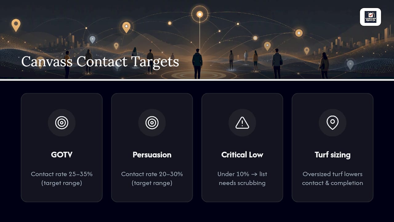
A live contact rate under 10% usually means the list needs scrubbing, not more dialers.
An opt-out spike almost always traces back to poor segmentation, meaning the wrong message went to the wrong list.
Turf sizing is not a rounding error. Turf clusters for a single three-hour shift should be sized to a moderate number of doors, adjusted for walkability and density, adjusted for walkability and voter density. Oversized turfs quietly tank contact rate and completion at the same time, and most managers blame the volunteers before they check the map.
For volunteers, track shifts completed against shifts required rather than only headcount, using easy volunteer recruitment tactics to maintain capacity and retention. A full canvass program might need roughly 2,400 trained volunteer shifts to cover a universe, and if weekly recruitment falls behind that target, you need a trigger already in place to shift part of the program to phone banking or bring in paid canvassers before the gap shows up in the pace ratio.
Running the Program Off the Dashboard, Not Around It
A dashboard only earns its keep if it changes what happens the next morning. Here's the daily and weekly rhythm that makes that happen.
- Recalculate pace ratio every morning, and update the denominator as the calendar shortens. Needed contacts per day should rise as days remaining fall, so a static target quietly understates how far behind you are.
- If pace ratio drops below 1.0, decide same day: reallocate turf to better-performing shifts, shift volunteers to phone or text, or authorize paid canvass hours. Waiting a week to react is how a 0.87 becomes a 0.65.
- Check persuadability targeting lift weekly as a quality audit. Flat or negative lift means canvassers are contacting convenient doors instead of flagged persuadables, which calls for retraining or a tighter walk list, not more volunteers.
- Watch how the metrics themselves shape behavior. If leadership only praises door counts, expect canvassers to rush contacts and skip the ID conversation. Pair every volume metric with a quality metric in how you report results, and say so out loud in team meetings.
Pro Tip: Post pace ratio and persuadability lift side by side on the same weekly chart. When one number looks great and the other is falling, that's usually the fastest way to catch a team optimizing for the wrong thing.
How Campaign Buddy HQ Puts This Framework to Work
Campaign Buddy HQ was built around exactly this playbook: outreach logging for doors, calls, texts, and registrations, feeding directly into daily and weekly views instead of a spreadsheet someone has to update by hand.
- Pace-style progress tracking that compares actual activity to your campaign goals in real time
- Turf and territory tools built for rural and low-density canvass programs, not just dense urban universes
- Daily and weekly planning views so field directors and volunteers see the same numbers
- Supporter tracking and campaign phases that keep persuasion, ID, and GOTV work organized separately
If you're currently piecing this together across three spreadsheets and a group text, a 7-day free trial with no credit card required is the fastest way to see whether a real dashboard changes how your team runs its week. Start the trial and load your first turf list before your next canvass shift.
Building Reporting Infrastructure That Field Staff Trust
Most campaigns that get this right run a simple two-layer stack: something to compute the numbers, and something to display them. A typical setup pairs a scripting tool for KPI calculations with an interactive dashboard for the display layer, so the math happens once and the visualization updates automatically instead of requiring a rebuild every Monday.
Interactive filters matter more than they get credit for. A county chair doesn't want the statewide view. She wants her turf, her volunteers, her pace ratio, filtered down in two clicks. Date range zoom does something similar for trend lines. Zoomed out, a pace ratio chart shows the whole arc of the program. Zoomed into the last five days, the same chart can reveal a sudden dropoff that a monthly average would hide entirely.
Trend lines deserve their own space on the dashboard rather than getting crammed into a corner. A single day's pace ratio can bounce around because of weather, a holiday, or one canceled shift. A seven-day rolling trend line smooths that noise out and shows you whether the program's trajectory, not just its snapshot, is heading the right direction.
Weekly written briefs still matter alongside the visual dashboard. A short summary document that names the top three flags and the actions taken forces someone to actually interpret the chart instead of just glancing at it and moving on.
Setting Realistic Benchmarks Before the Program Starts
Targets only work if they're set before the pressure hits, not invented mid-campaign to justify whatever number came in. Those aren't arbitrary. They come from what comparable field programs typically achieve, and they give you a baseline to compare against instead of guessing whether this week's numbers are good or bad.
Local conditions shift those baselines. A dense urban turf with high walkability will beat the canvass contact-rate range; a rural program with long drive times between doors may sit below it and still be performing well relative to its own history. Set your realistic target from your own first two weeks of data, then use the general benchmark as a sanity check rather than a hard rule.
Persuadability lift benchmarks work differently since there's no universal target. What matters is the direction. A Riverside County example showed 61% of the contact goal reached alongside an 11-point persuadability lift and a 24% conversion rate, which illustrates something benchmarks alone can't show: a program can be behind on raw penetration and still be converting the voters it does reach at a strong rate. Reading pace ratio without lift, or lift without conversion, misses that nuance entirely.
Revisit every benchmark at least once mid campaign. A target set in month one based on early enthusiasm rarely survives contact with a tired volunteer base in week six.
Connecting the Dashboard to Your Voter File and CRM
A field dashboard is only as good as the data pipeline feeding it, and that pipeline runs through your voter database or CRM. Outreach logged in the field, whether that's a canvasser marking a door or a phone banker logging a call, needs to flow into the same system that holds your voter universe, support scores, and turf assignments.
The practical failure mode is a one-way sync. Data moves from the CRM out to a canvassing app, but results don't flow back in cleanly, so your dashboard shows yesterday's contacts against last week's targeting file. That gap is where persuadability lift calculations go wrong, because the model recommending who to contact needs to know who's already been reached.
Integration also determines how fast your turf lists update. If a supporter gets ID'd as a strong yes on Tuesday, a well-connected system pulls them out of Thursday's persuasion turf automatically. Without that link, volunteers waste shifts re-contacting people who are already locked in, which quietly drags down both contact rate and conversion numbers without anyone noticing why.
Platforms built specifically for outreach tracking handle this by keeping logging and targeting in the same system rather than stitching together a separate canvassing app, a separate phone tool, and a separate spreadsheet for volunteer shifts. Fewer handoffs means fewer places for data to go stale.
Why Update Speed Changes What You Can Decide
Latency, the delay between an action in the field and its appearance on the dashboard, determines what kind of decisions you can actually make. A dashboard that updates overnight is fine for strategic planning. It's useless for redirecting a canvass shift that's underperforming at 2pm on a Saturday.
Real-time or near-real-time updating (contacts appearing on the dashboard within minutes of being logged) lets a field director reallocate volunteers mid-shift instead of mid-week. If a turf is running at half the expected contact rate by midday, that's actionable information only if someone sees it while there's still time to move volunteers to a better-performing area.
The tradeoff is noise versus signal. A dashboard updating every few minutes will show natural swings, a slow patch during lunch, a burst of contacts after school lets out, that can look like a crisis if you're staring at raw numbers instead of trends. Set a reasonable refresh interval (15 to 30 minutes tends to work for most canvass operations) and pair it with the rolling trend lines mentioned earlier, so short-term fluctuation doesn't trigger overreactions.
The bigger risk with slow-updating systems isn't false alarms. It's the opposite. A genuinely broken turf or a script that's turning off phone bankers can run for days before a weekly report catches it, by which point you've lost contacts you can't get back.
Turning Dashboard Numbers Into Field Decisions
Numbers on a screen only matter once they change what a captain tells a volunteer. A few concrete examples of that translation:
The fix is usually the turf, not the volunteer.
A persuadability lift that's flat despite a targeting model flagging clear priorities usually means canvassers are knocking whoever answers, regardless of the priority list. The fix is a script refresher and tighter list discipline, not more contacts.

A phone bank showing strong live contact rate but weak conversation completion often points to a script problem: the opener works, but something in the middle of the call is losing people. Pulling call recordings from the worst-performing shift usually surfaces the exact line where people hang up.
A text program with rising opt-outs in one segment but not others is almost always a targeting mismatch, the wrong message landing with the wrong list, and the fix is splitting that segment before the next send rather than pausing the whole program.
Each of these examples starts the same way: a number moves outside its expected range, and someone asks why before deciding what to do about it. That habit, treating every anomaly as a question rather than a verdict, is what separates a dashboard that drives decisions from one that just gets glanced at during a weekly call.
Keeping the Numbers Clean Enough to Trust
A dashboard is only as trustworthy as the data entered by the volunteer standing on a doorstep, and that's where most accuracy problems actually start. Build in structural safeguards rather than relying on everyone to fill out every field correctly.
Require the minimum fields that make a contact usable: outcome, support score if reached, and timestamp. Anything beyond that should be optional, because forcing volunteers to fill out ten fields per door means they'll start skipping doors or fudging entries just to finish a shift.
None of those flags prove fraud or error on their own, but each is worth a quick check before the number feeds into a dashboard someone will use to make a call.
Reconcile the field data against the source voter file on a fixed schedule, weekly at minimum, to catch duplicate entries, dropped records, or sync failures between your canvassing app and your CRM before they distort pace ratio or turf completion numbers. A one-time reconciliation at the start of the program isn't enough, since sync errors tend to compound as volume increases.
When something looks wrong, correct the record rather than the aggregate number. Adjusting a dashboard total by hand to "fix" a bad reading just hides the underlying data problem and guarantees it happens again next week.
Getting Volunteers to Actually Use the Numbers
The best dashboard in the world does nothing if the people generating the data don't understand what it's for. Training on field metrics needs to happen at two levels: what to log, and why it matters.
Volunteers and canvassers need a five-minute explanation, not a manual, covering exactly what counts as a contact, how to record a support score honestly rather than optimistically, and why skipping the ID question to knock one more door actually hurts the program. Framing it as "your accurate answer helps us find the right doors next week" lands better than a lecture on data integrity.
Turf captains and shift leads need a step further: how to read the daily dashboard view well enough to spot a problem before a field director calls about it. That means knowing what a normal contact rate looks like for their specific turf type, so a dip registers as a signal rather than getting shrugged off as a slow day.
Field directors and campaign managers need the deepest layer: pace ratio math, how to read persuadability lift, and the decision rules for when a number crosses a threshold that requires action. This is also where the weekly reporting cadence earns its place, since a written brief forces the interpretation step that a chart alone can skip.
Revisit training whenever the target metrics change, not just at program launch, since a shift from persuasion phase to GOTV changes which numbers matter most.
Dashboards Are Plans, Not Reports
The mistake I see most often isn't a missing metric. It's treating the dashboard as something you check, rather than something you argue with every week. A dashboard is a living plan, and a living plan gets revised, not admired.
Run a standing weekly analytics meeting with a fixed format: the top three flags from the past week, the top two actions the team is committing to, who owns each action, and by when. Skip the meeting where everyone nods at the pace ratio and moves on. If nothing on the dashboard changed anyone's Tuesday, the meeting failed.
Daily check-ins should be shorter and narrower: pace ratio, yesterday's contact rate by channel, and any turf flagged red on the heatmap. That's it. Save the trend analysis and lift audits for the weekly session, where there's room to actually think.
— Billy
Get Your Field Program Running on Real Dashboard Data
Campaign Buddy HQ is built for campaigns that are done tracking outreach across scattered spreadsheets and group texts. Instead of piecing together doors knocked, calls logged, and volunteer shifts from five different sources, everything feeds one daily and weekly view, purpose-built for progressive campaigns and issue-advocacy field programs, including the rural and low-density turf work that most generic tools ignore.
It suits campaign managers who need to see pace against goal without opening a spreadsheet, and organizers who need turf and volunteer data in one place instead of chasing down five team leads for updates. If the metric shortlist and channel targets in this guide made sense to you, the platform is built to surface exactly those numbers without you building the dashboard yourself.
Start the 7-day free trial, no credit card required, and load your current turf list to see your first real pace ratio by tomorrow morning.